Empowering Pet Parents to Manage Their Pet's Health
Overview
MediPaw is an app that connects pet parents with their vets. Users can book vet appointments, view their vet’s appointment notes, and keep track of their pets health all in one place.
Role
UX/UI Designer
UX Researcher
Duration
4 weeks
Sept 2021 – Oct 2021

The Problem
It’s difficult for pet parents to organize their pets’ health information and stay up to date with their pets’ health. And ineffective appointment booking methods leave vets with either wasted time or not enough time to help their patients
The Solution
An app that allows pet parents to manage their pet’s health by booking vet appointments, keeping track of their pet’s health records, receiving reminders for annual vaccinations, and more.
Survey
Testing the Waters
I started my discovery phase with a survey to understand my potential users’ behaviours and test my concept for a vet appointment booking app. I found that most people surveyed have not booked a vet appointment virtually, but there was a very large interest in using virtual booking for vet appointments.
Have you ever used virtual booking for a vet appointment?

Would you be interested in using virtual booking for a future vet appointment?

User Interviews
Digging Deeper
After my survey, I felt confident in my idea, but still had a lot of questions. Why had so few people used virtual booking for vet appointments? What were my potential users looking for in a pet health app?
I interviewed five pet parents and one vet to get a deeper understanding of my potential users’ pain points and needs.
What I Discovered
It’s important for the booking process to be seamless because human errors in booking cause problems at the clinic
Pet parents want a quick and easy way to book vet appointments
Pet parents want a centralized place to manage their pet’s health
When interviewing the vet, they discussed how issues with appointment booking cause problems for the vet staff. It was very important that:
1) clients are able to identify all the reasons for their vet visit
2) The length of the appointment is determined by the complexity of the presenting issues
3) clients are able to add photos and notes of their pets’ condition for the vets to review before the appointment
When interviewing the pet parents, I learned that the main draw of online appointment booking are the efficiency and ease of making an appointment when the user has a busy schedule. Pet parents also discussed their need to manage all aspects of their pets’ health. Keeping track of their health records and notes on their pets’ health was very important to them. This broadened the scope of my app and made it a more comprehensive pet health management app.
Personas
Defining and Empathizing with the Users
I created user personas to summarize my interview findings and empathize with the users. I found user personas to be helpful in a few ways. When designing my solution, I was able to imagine how my user personas would interact with the product. And when making decisions, I would consider how I could add value to their experiences.


Competitive Analysis
What Else is Out There?
As my app concept was taking shape, I needed to see what else was out there. I performed a competitive analysis on some popular pet health apps as well as the app my vet office uses.

Wireflow Sketches
Ideating
I started by making some quick sketches to get my initial ideas down.
During this stage of my design process, I let go of all my judgments and get as many ideas down as possible.
After that, I narrowed down my sketches and drew arrows to show a rough user flow. This made the wireframing process much quicker because I had my wireflow sketches to refer back to.
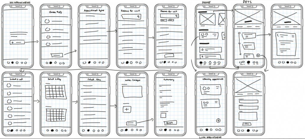
Wireflows and low fidelity usability testing
Design, Test, Iterate, Repeat
It was important to me that I started testing as soon as I could. I prototyped my four task flows and tested them with 11 pet parents. I conducted unmoderated usability testing because it allowed me to conduct more tests on a short timeline.
Users struggled with two out of four flows, so I focussed on how to improve them.
Unsuccessful
Task: add a note to your pet's health profile

Unsuccessful
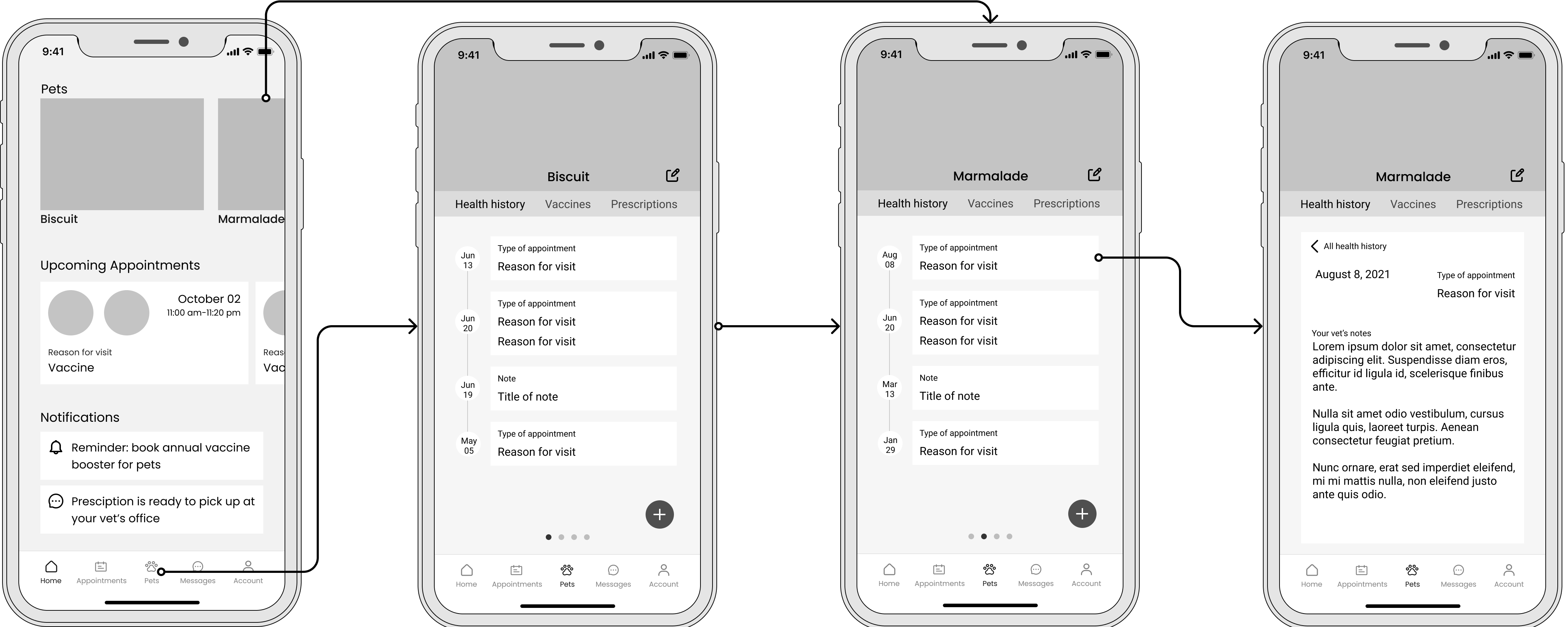
Task: view your vet’s notes from a previous appointment


Successful
Task: Book an annual vaccine appointment for two pets

Successful
Task: book a sick appointment for your pet

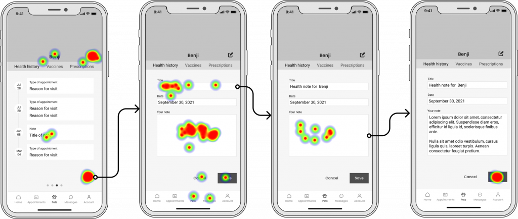
Task: add a note to your pet's health profile
To edit a pet’s details I used an “edit” icon. I thought it would save space, make the UI more minimal, and assumed it would be an icon most users would be familiar with, but it ended up causing a lot of confusion. With the heat map, you can see where many users were misclicking.
Success rate
80%
Misclick rate
23%
Completion time
1m 23.0s
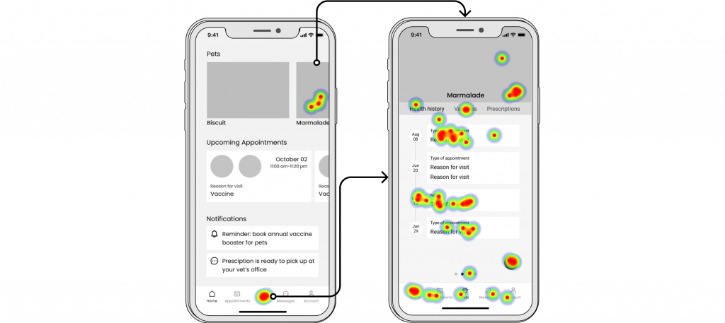
Task: view your vet's notes from a previous appointment
Here, I found that users had trouble accessing notes from past appointments. The cards did not look like they were clickable, so users were clicking all over the screen. The heat map shows how users were clicking all over the screen trying to figure out what to do.
Success rate
90%
Misclick rate
9%
Completion time
49.0s
Iterations
Problem Solving For the Pain Points
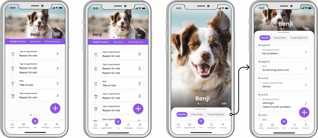
Armed with these new findings, I jumped into designing iterations. I knew what the problems were, but there were many ways to solve them. Below are some of my iterations and my final solution. I tried adding chevron arrows to communicate that the cards were clickable elements and changed the edit icon to a text button.
For the final solution on the right, I created a modal that users swipe up to access more information. And when the modal is down, users can swipe left and right to navigate between their pets. This helped focus the user on the information they were looking at and made the navigation between different pets more clear. I added a darker gradient at the bottom to ensure enough contrast for accessibility and create a feeling of depth.
Style Tile
Creating Visual Consistency
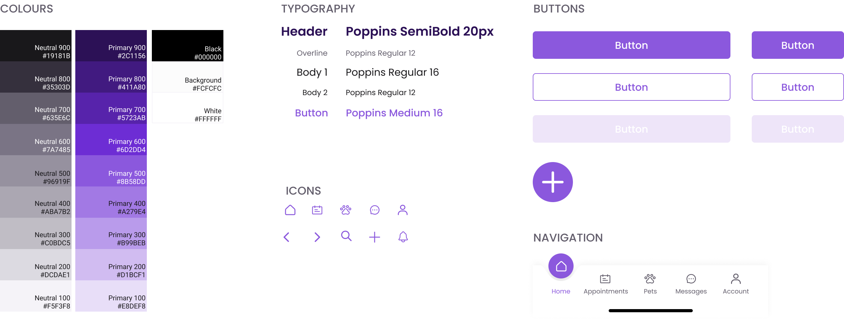
I created a style tile to ensure visual consistency throughout my design. I went for modern and minimalist visual design with an eye-catching purple. I followed accessibility best practises from the WCAG.
Solution
Outcomes of High-Fidelity Usability Testing
Again, I conducted unmoderated usability testing and after completing the tasks, I asked participants to answer questions from the System Usability Scale. Overall, my app received a system usability score of 85%. With the average score being 65%, I’m very satisfied with my results.

Task: view a note from your pet’s most recent appointment
Success rate
90%
Misclick rate
5%
Completion time
45.7s
Task: add a note to your pet’s health profile
Success rate
100%
Misclick rate
6%
Completion time
35.2s
Task: book a vaccine appointment for two pets
Success rate
100%
Completion time
1m 0.9s
Task: book a sick appointment for your pet
Success rate
100%
Completion time
1m 11.6s
My Learnings
The biggest breakthroughs came about through usability testing. I made a lot of assumptions with my initial wireframes and user testing helped to validate or disprove them. After analyzing and interpreting the results of the usability tests, I saw a clear path for the changes I needed to make with the iterations.
Unmoderated usability testing allowed me to get a lot of results very quickly. It was a great tool given my short timeframe to complete the project. I also enjoyed using the system usability score as a standardized measure. I think using the system usability score with unmoderated testing minimized bias because users didn’t feel as much pressure to answer positively since I was not there to observe them. In the future, I’d like to try moderated usability testing so I can compare the different methodologies.